Hilltop Game Dev Club
An identity built to represent a new space for creativity, collaboration, and game development on campus.
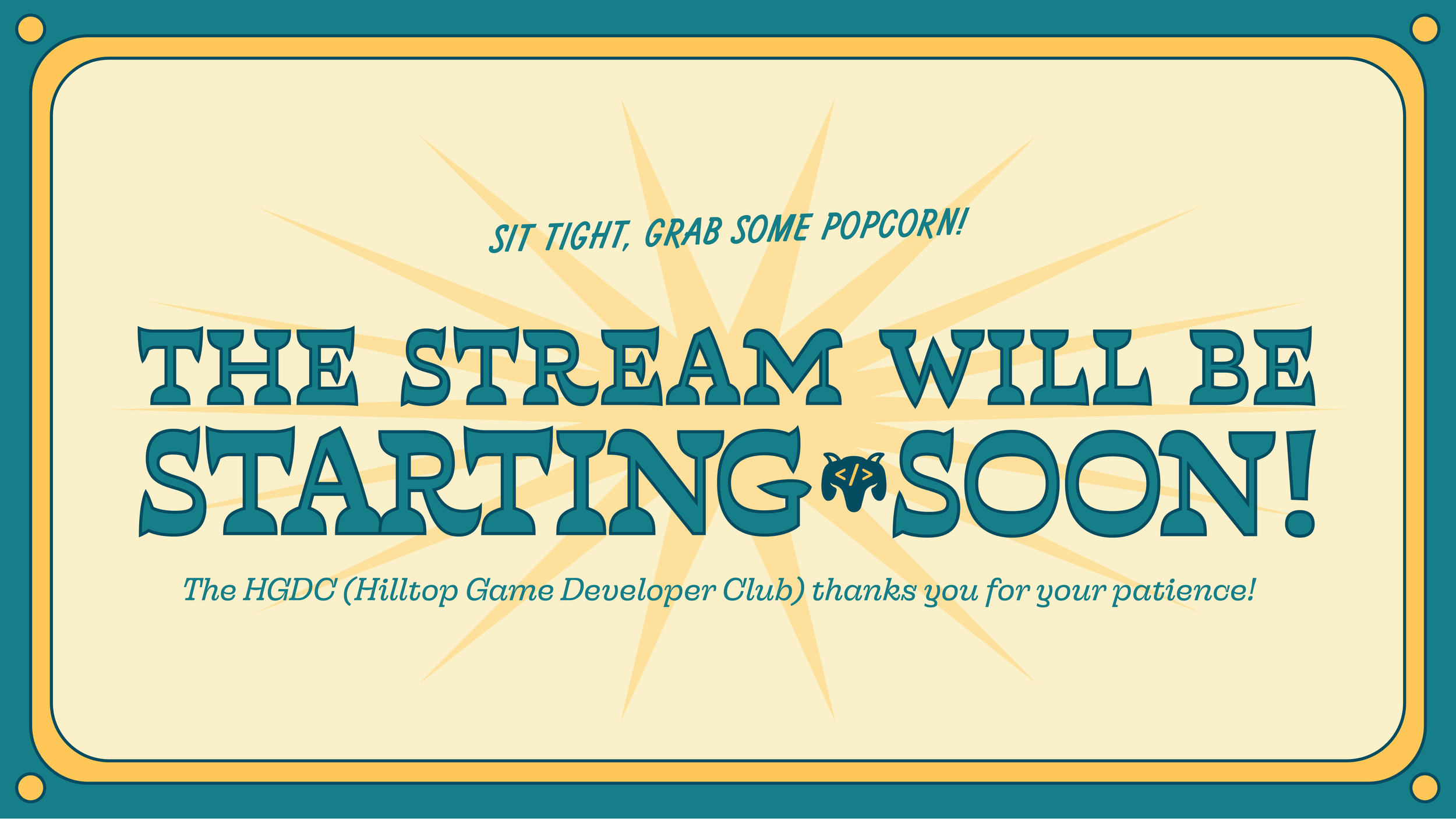
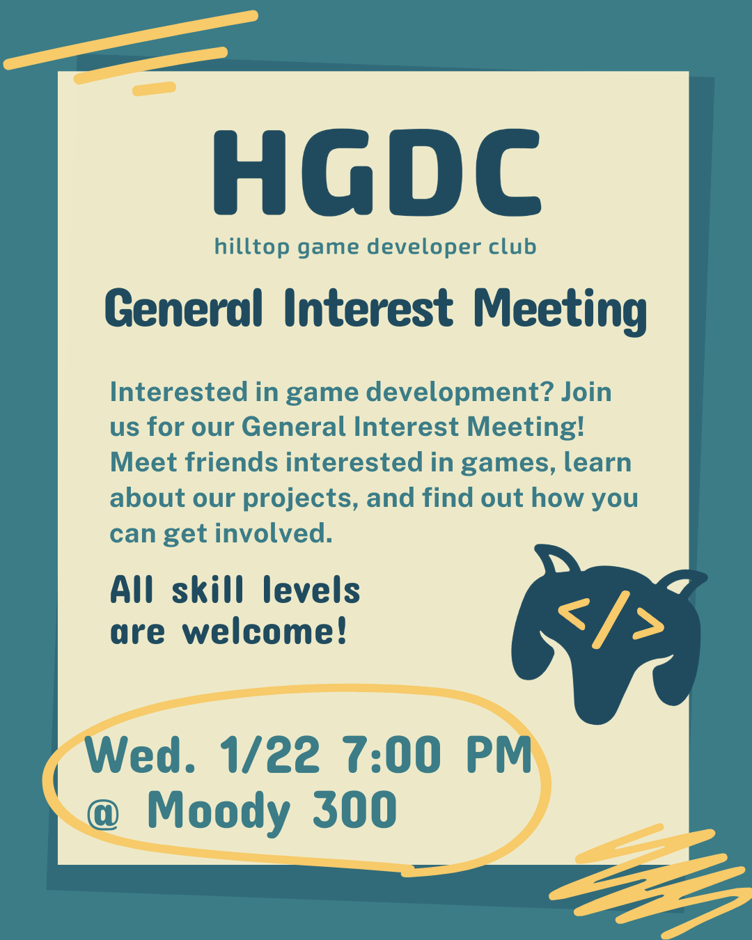
HGDC is a student organization I co-founded with friends to give aspiring game developers at St. Edward’s University a space to connect, learn, and create. From the start, we knew a strong visual identity would help build credibility, attract members, and foster a real sense of community.
Designing HGDC’s identity meant creating something that felt approachable, energetic, and true to both our love for games and our campus spirit. The logo became a symbol of our collective effort to make game development more visible, inclusive, and exciting for students of all backgrounds.


I began by sketching early logo ideas that could represent both the creative and technical sides of the Hilltop Game Developer Club. The concept centered around three key elements: a goat motif (a nod to our university mascot), an N64 controller (shaped to resemble a goat’s head and ears), and the HTML symbol (to represent programming and development).
These rough sketches helped me explore how to visually merge gaming and school spirit into one cohesive mark - playful, easily recognizable, and grounded in the identity of our campus community.
Concept Sketches

For the color palette, I drew inspiration from St. Edward’s University’s classic colors (navy blue and gold) to create something familiar yet fresh for students. The final palette features a warm cream, medium yellow, teal, and dark teal.
This combination keeps the identity approachable and energetic while maintaining visual ties to the university’s branding, helping HGDC feel immediately recognizable and rooted in the campus community.
Color Palette

With the concept and color palette finalized, I brought the logo into its digital form - refining the controller-goat hybrid for clarity, balance, and versatility across formats.
For the wordmark, I chose a soft sans serif typeface with slightly boxier shapes, striking a balance between approachability and structure. It complements the playful logo while keeping the overall identity clean, modern, and readable.
Together, the final mark and wordmark create a flexible identity system that captures HGDC’s creative, collaborative spirit and helps establish its presence on campus.


